
LITTLE TILT
THE DESIGNER’S OWN HOME, NO BRIEF, NO CLIENT. JUST AN HONEST EXPRESSION OF EVERYTHING STUDIO SANTOS BELIEVES IN.
There is something revealing about a designer's own home. No client brief to interpret, no compromises to negotiate and no managing expectations. Just a house and a point of view, and the chance to find out whether they match.
We live in a 1930s home in The Tilt, a quiet neighbourhood in Cobham, Surrey. It is nearly a hundred years old. The floors are dark wood. The fittings are brass. There are marble surfaces and vintage finds, and the kind of settled feeling that takes time to build. We plan to stay. We plan to entertain here, to raise our sons here, to keep adding to it slowly as the years go on.
These are three of the rooms we have worked on so far.
Scroll to the end for before images.


LiTTLE TILT
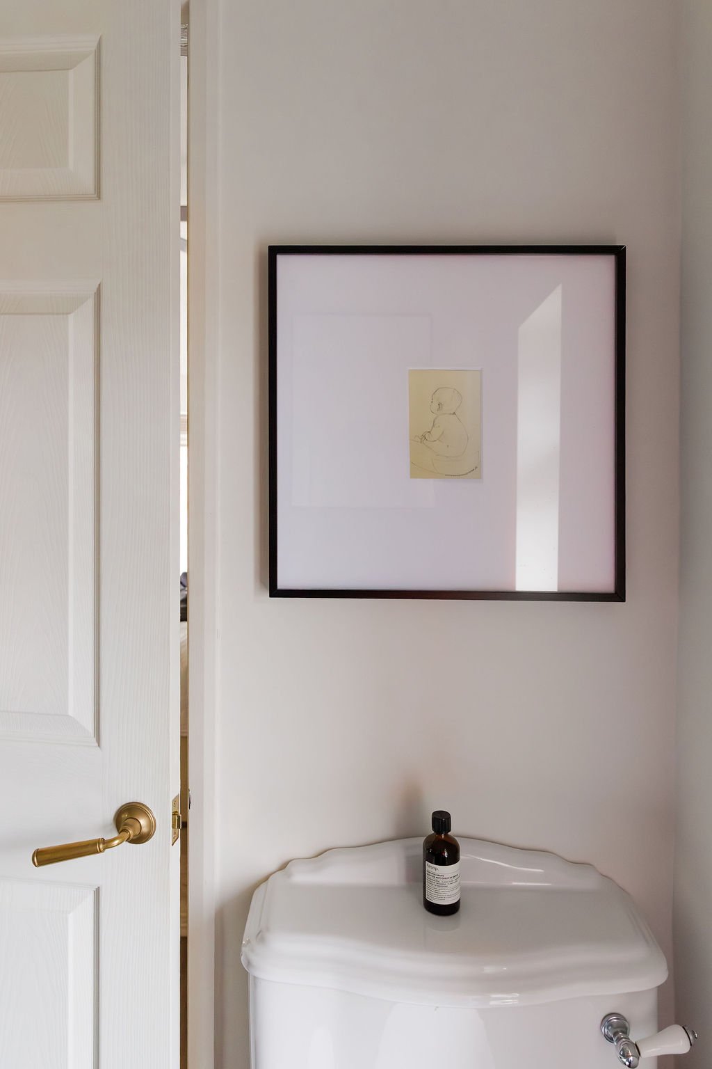
We are from Gibraltar, so it is wonderful to have artwork with such a personal touch - one of a kind.
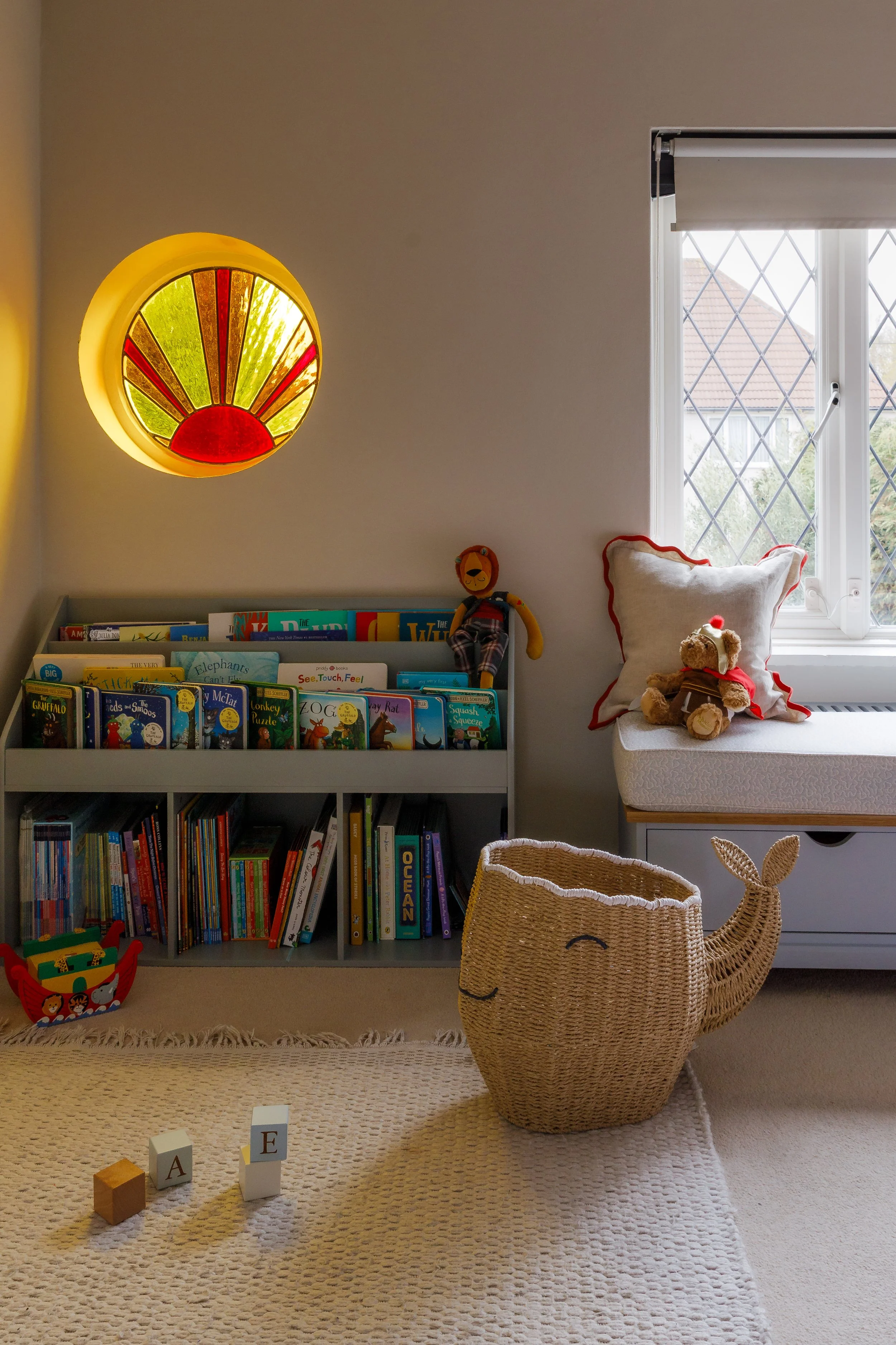
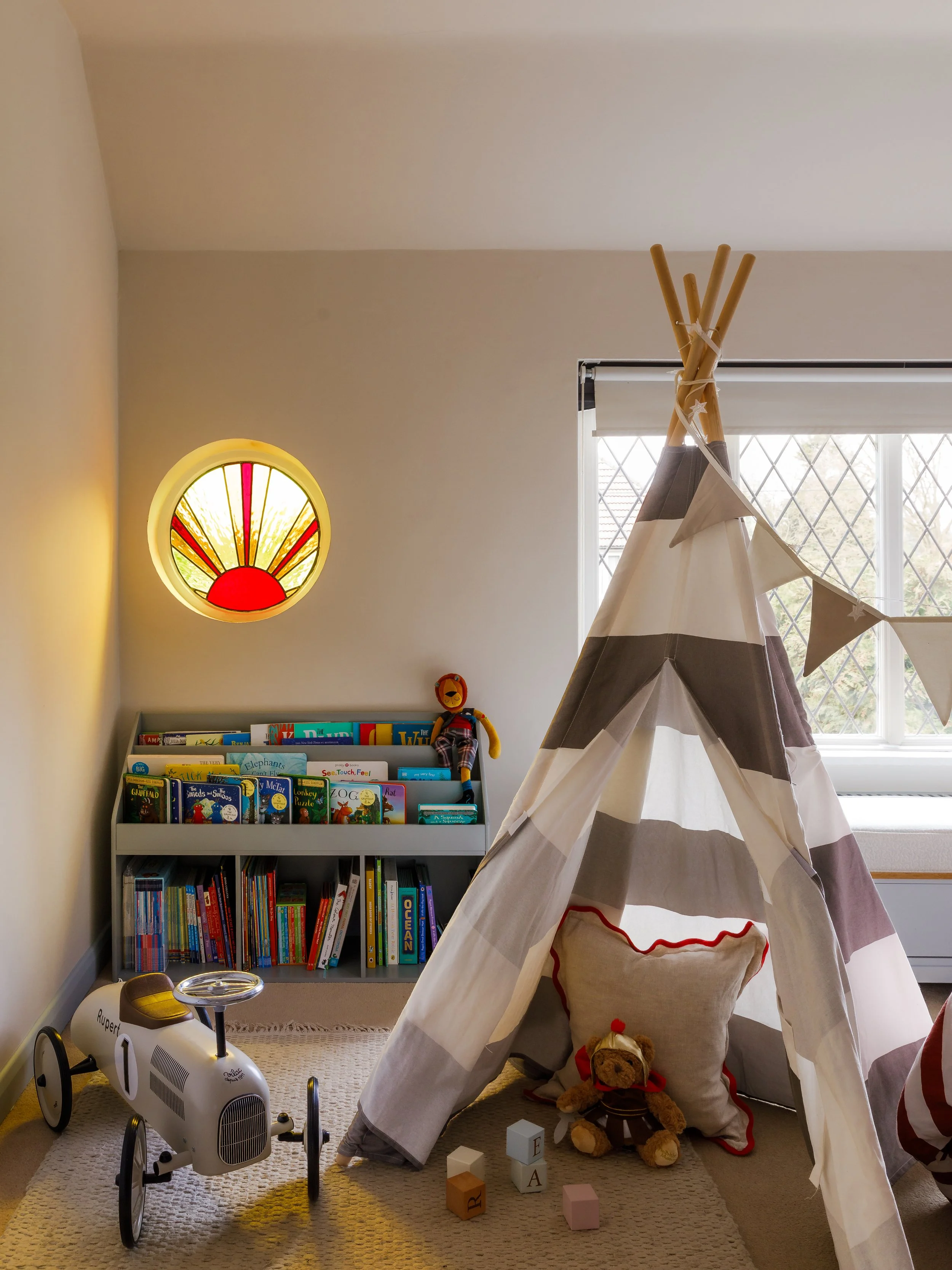
The porthole window is original to the 1930s house. Our carpenter made a round cover for it so he can sleep in the dark, but during the daytime, it casts warm red and yellow light into the room. In front of it sits a teepee. Next to that is the reading corner where we spend most evenings before bed.
The walls are neutral. The bedding changes as our son grows. We hope this room will grow with him - for now, we’re pretty happy with how it turned out.
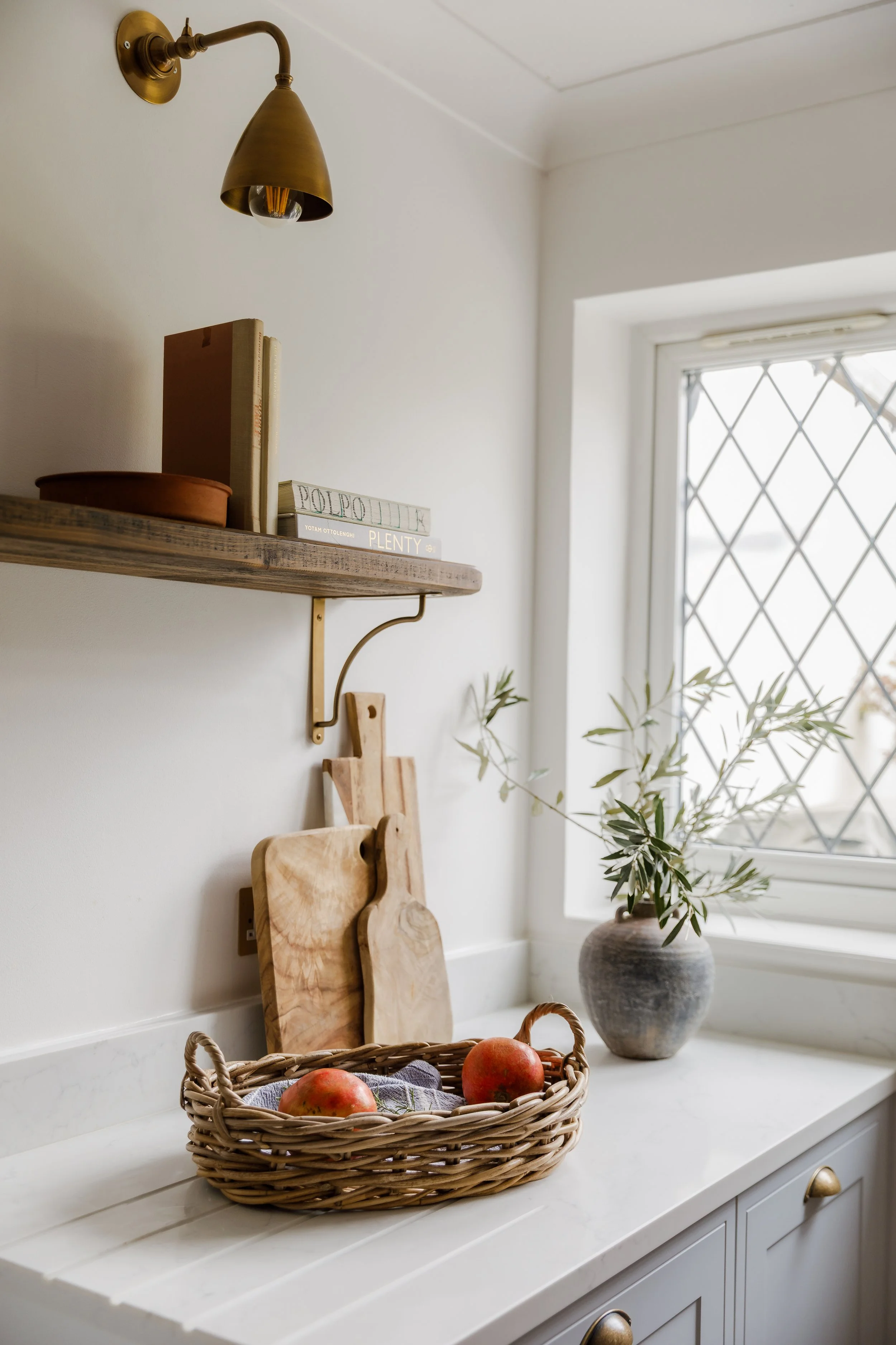
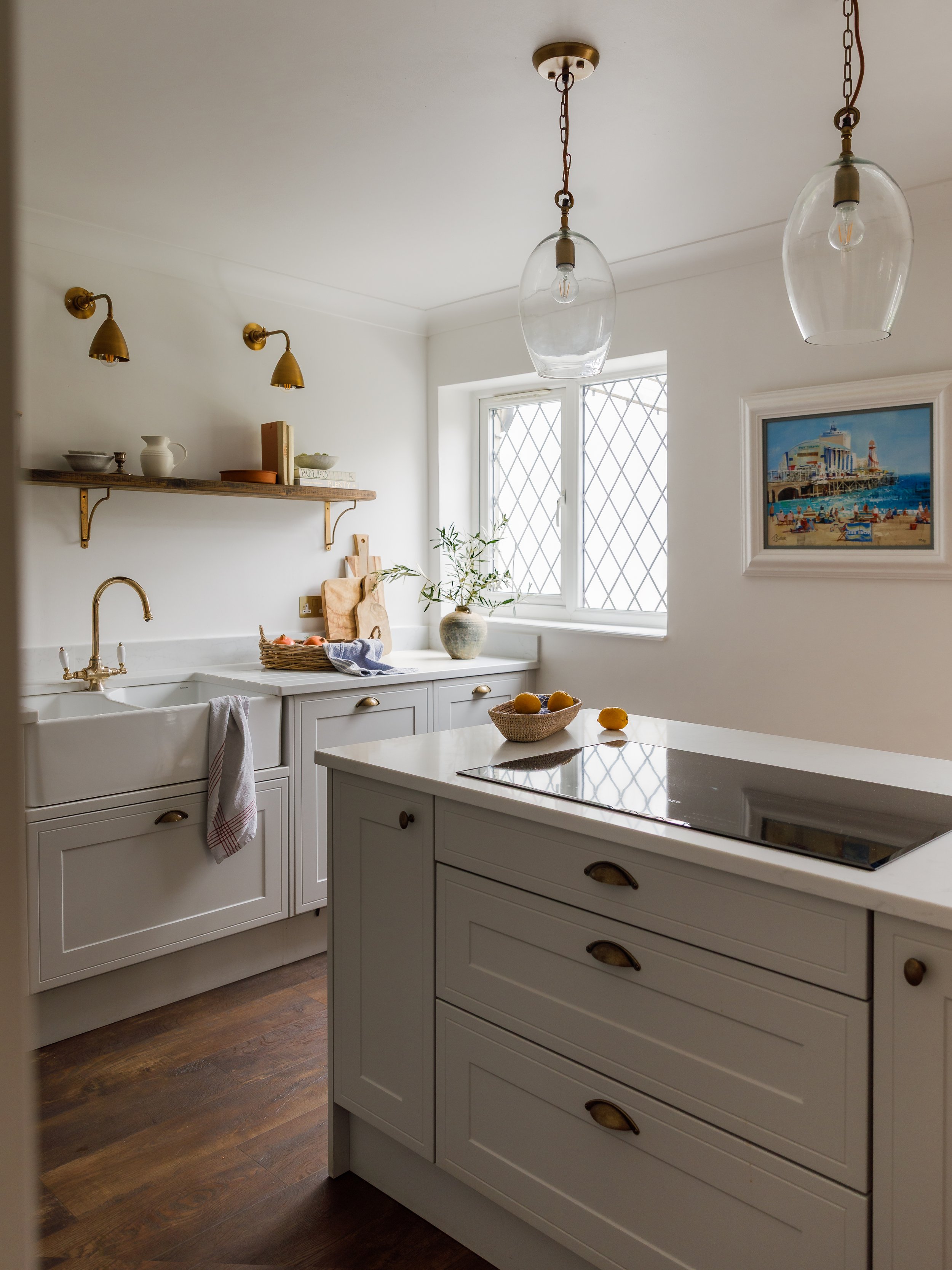
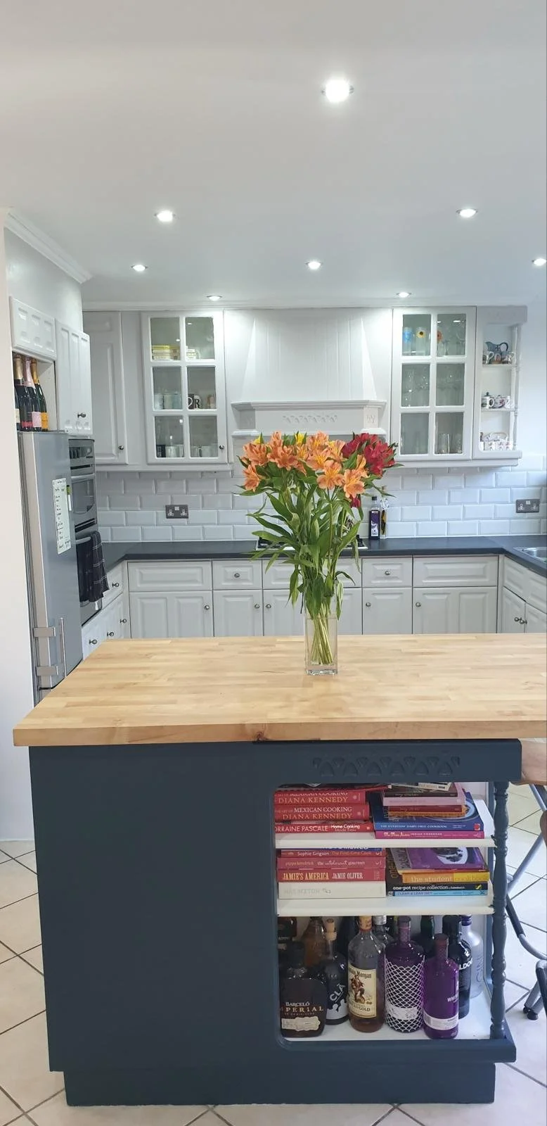
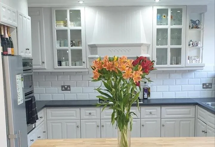
The kitchen was small and cramped when we arrived. Units all the way around, a floating island that felt disconnected from everything, and a doorway that cut off a run of cabinets far too soon, making the room feel shorter than it was.
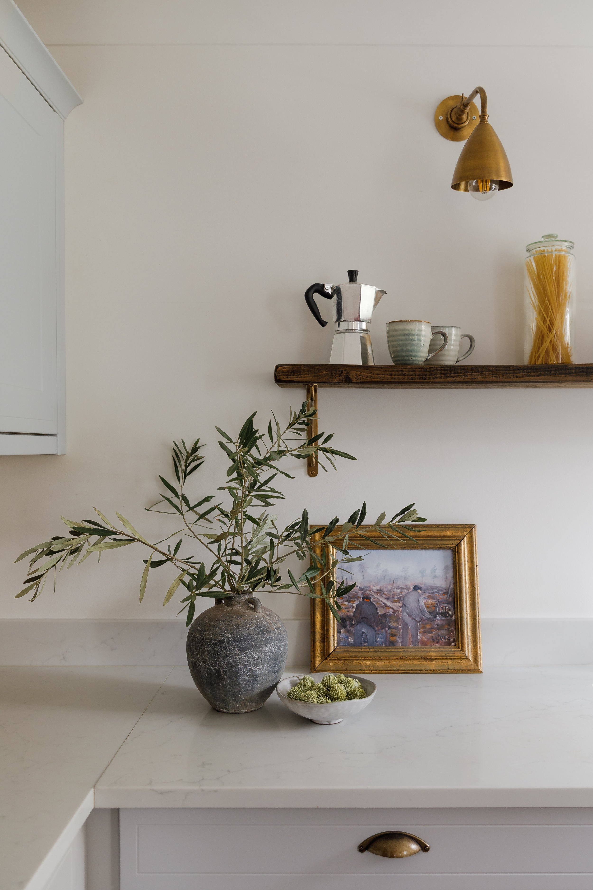
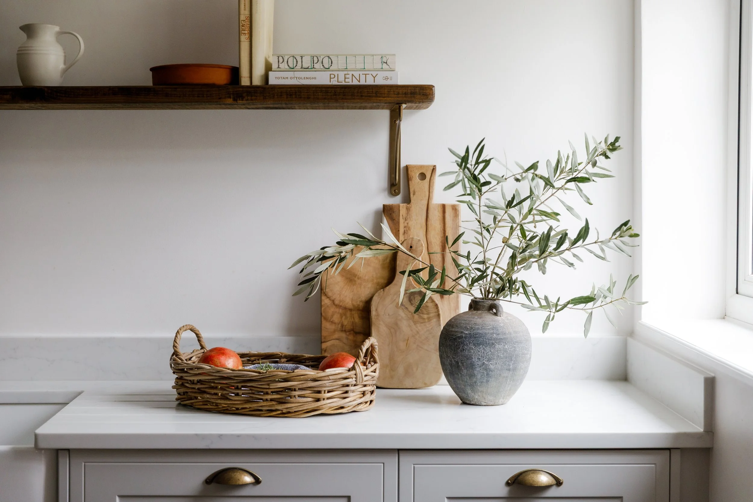
The first move was simple but transformative: extend the units past the doorway on both sides. Suddenly, the kitchen had length. Then we removed one run of units entirely and replaced it with a proper island. The top shelves at the back came down and in their place went a single shelf in natural wood, which opened the room up and made it feel wider and lighter than it had before.
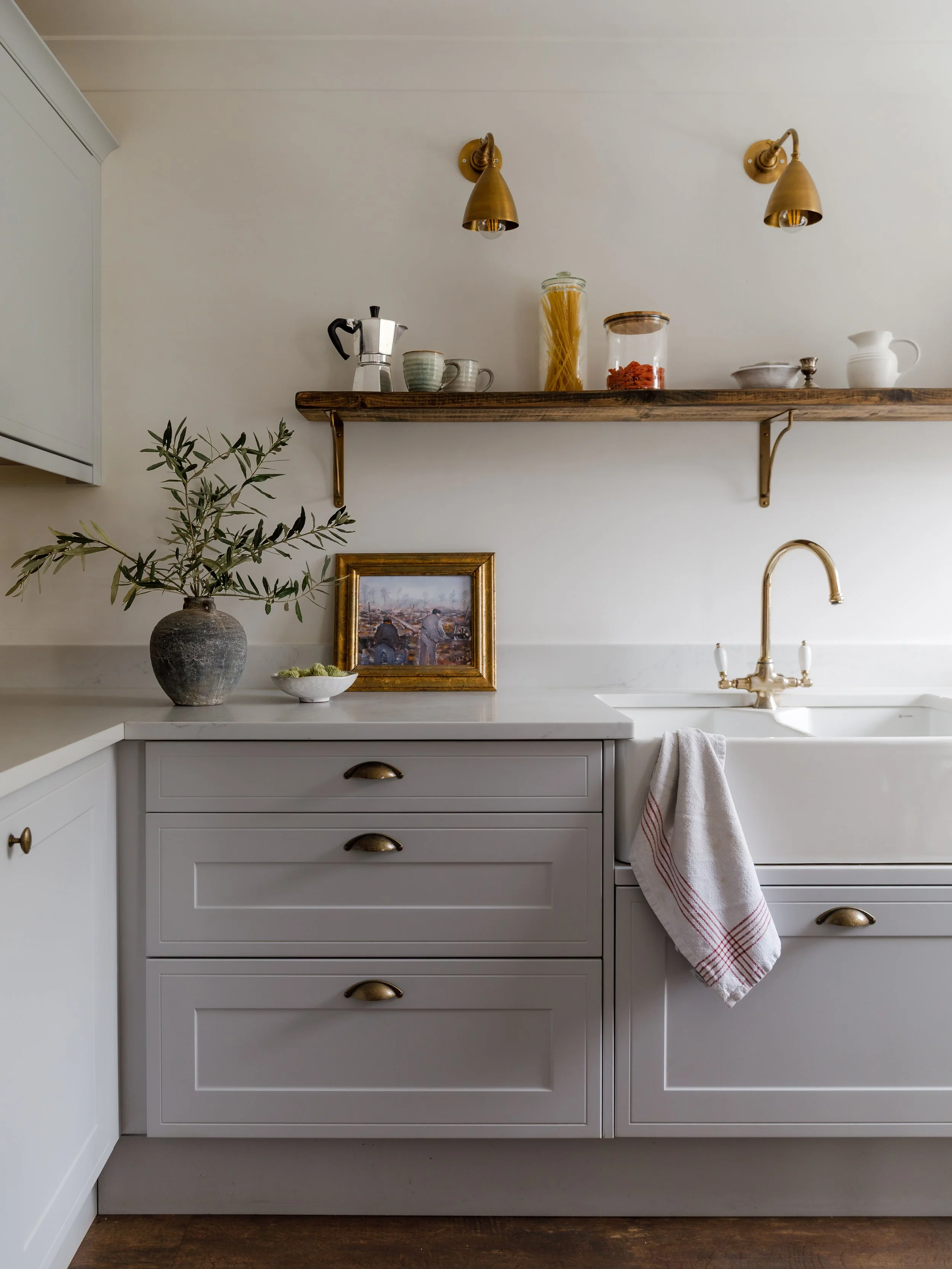
The result is a kitchen that works. There is a long run of worktop for serious cooking. There is a large pantry for the kind of larder we always wanted. There are open shelves for baking things, for the bowls and glasses that get used every day. The island is wide enough for the family to sit at throughout the day. The lighting is layered throughout: task lighting over the sink and hob for when the downlights are too much in the
evenings, and softer, lower light for when the kitchen shifts from a place of cooking to a place of sitting.
The feeling we were going for was Mediterranean. Not the aesthetic exactly, but the spirit of it. A kitchen that is made to be used, made to be gathered in, made to feel like the centre of the house rather than just a room where food gets prepared. We think we got there.
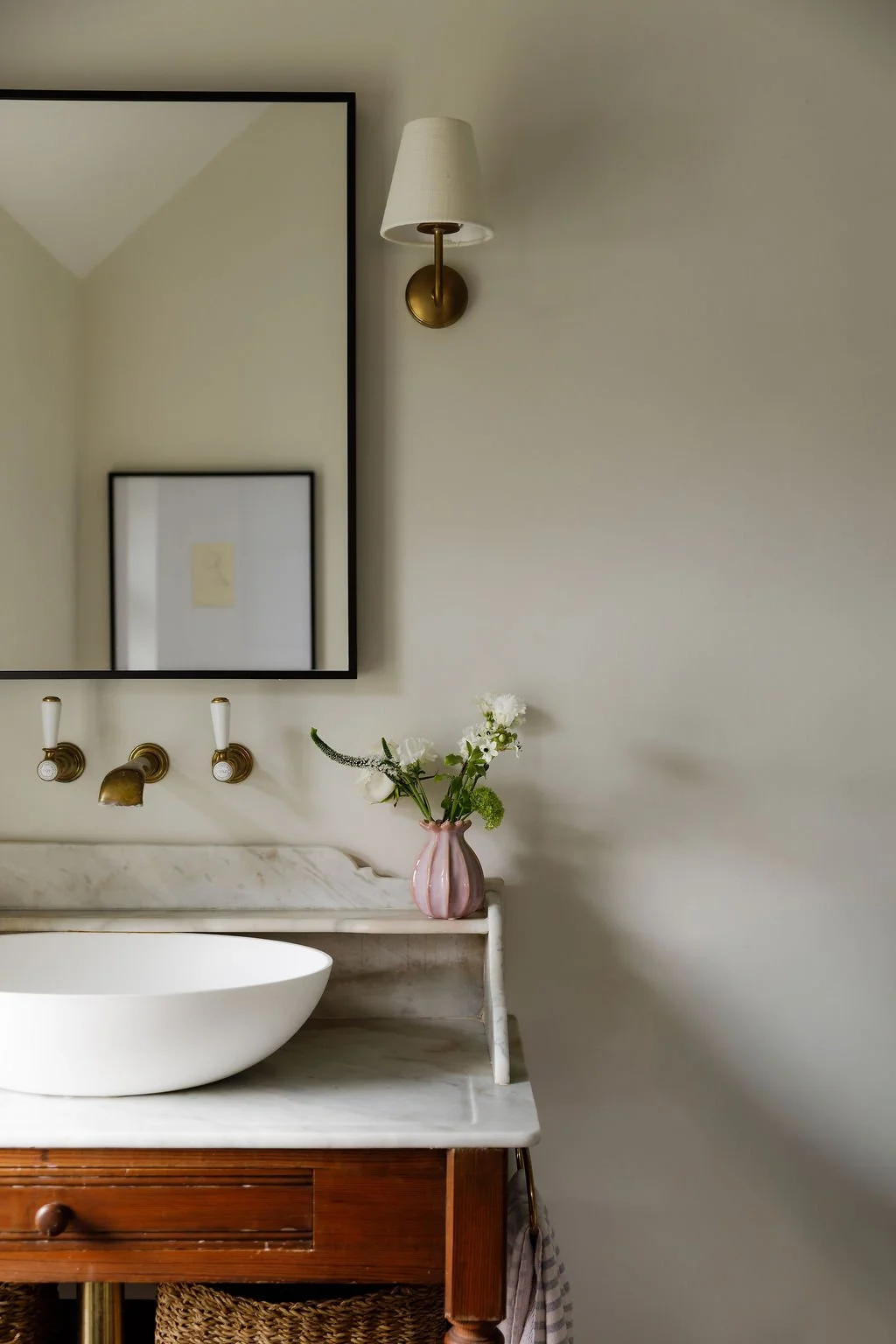
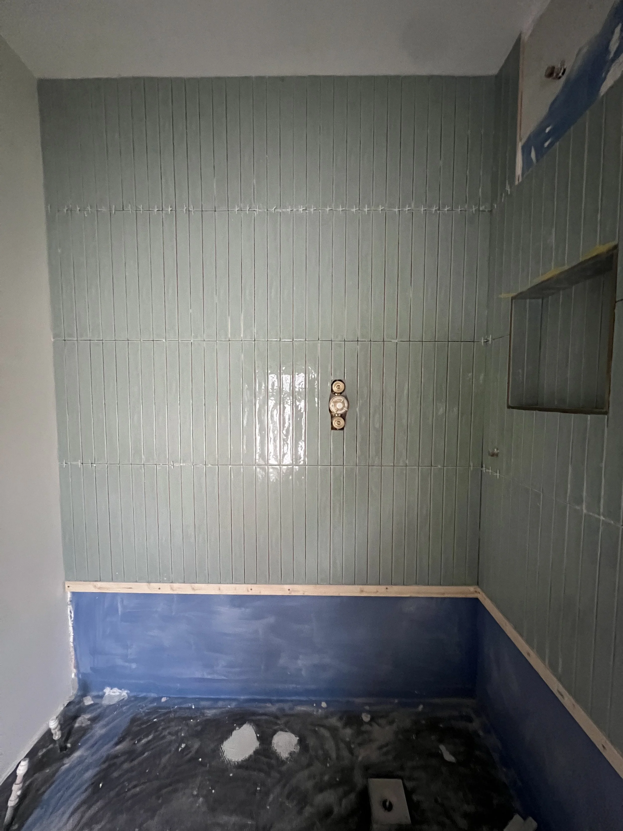
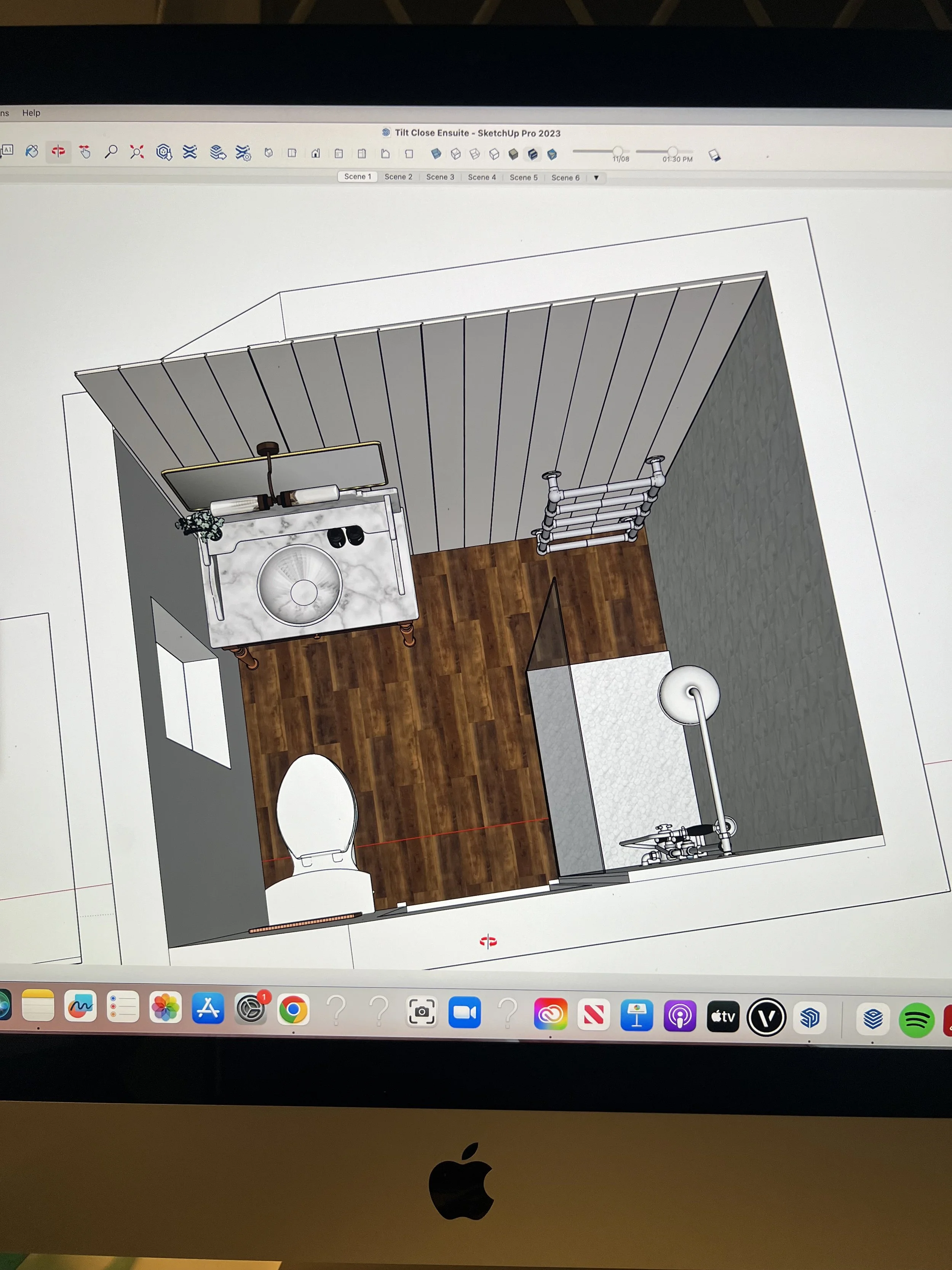
The ensuite is the calmest and tiniest room in the house.
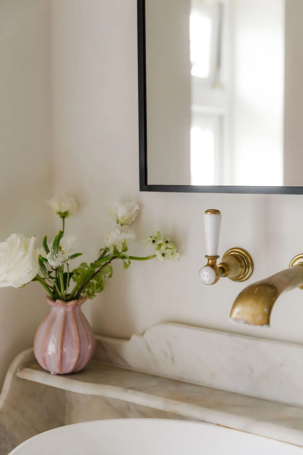
The tiles are blue-green ceramic, set vertically to make the most of the room's unusually tall ceilings. Natural wood, marble and ceramic sit together, adding textural differences which complement one another. The walls are neutral, a deliberate choice: we wanted a backdrop that lets the materials speak rather than compete with them.
The piece the room is built around is a repurposed Victorian washstand with a marble top and splashback. It is old, characterful, and completely unexpected in a contemporary bathroom setting. That is exactly why it works. Warmth and texture are difficult things to achieve in bathrooms. This washstand does both.
Brushed brass on the shower and taps adds warmth and sheen to what are otherwise entirely matte materials.
The ensuite feels luxurious, calming and spa-like, exactly the feeling we wanted to achieve whether we’re getting ready for the day or winding down after a long day.
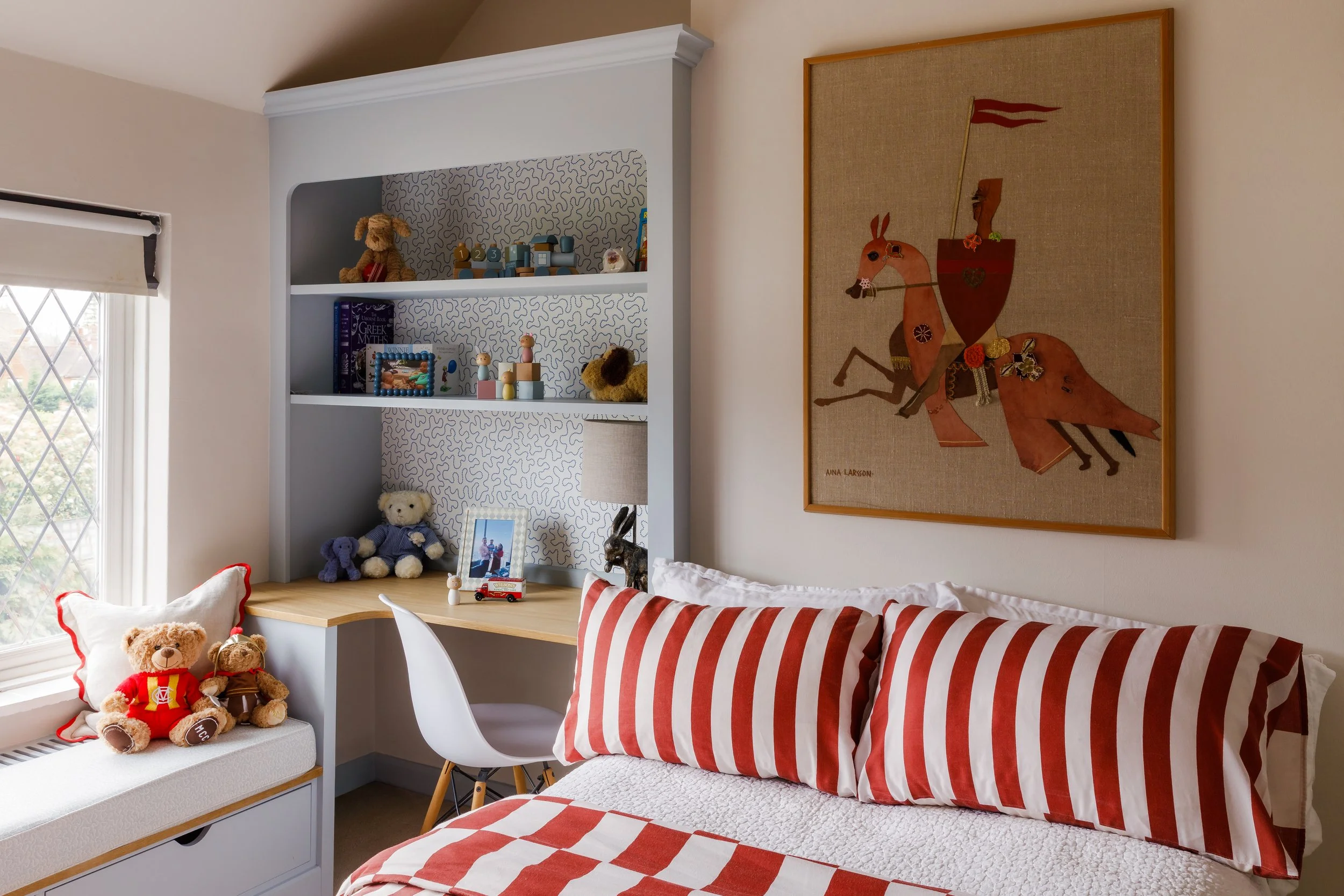
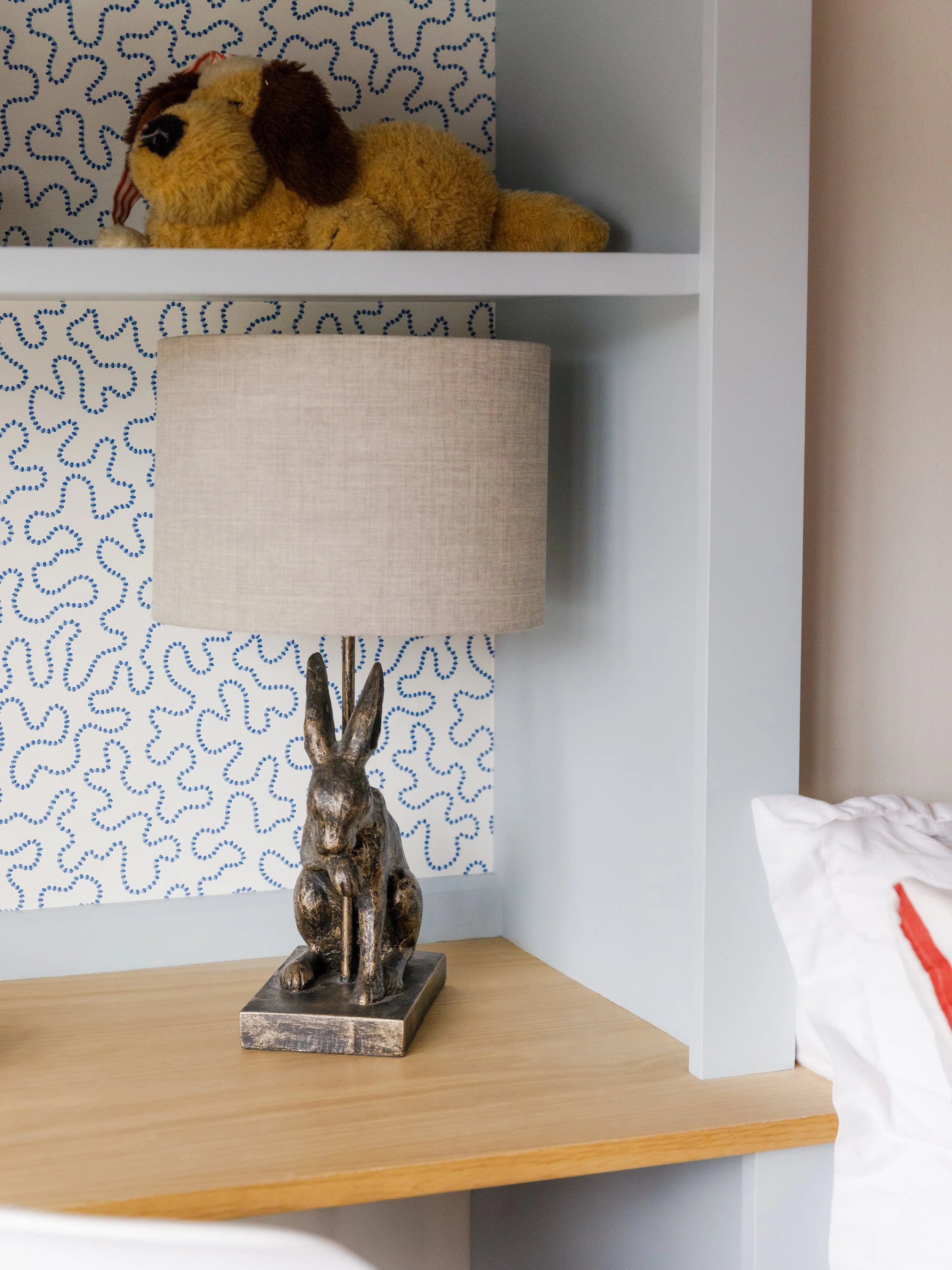
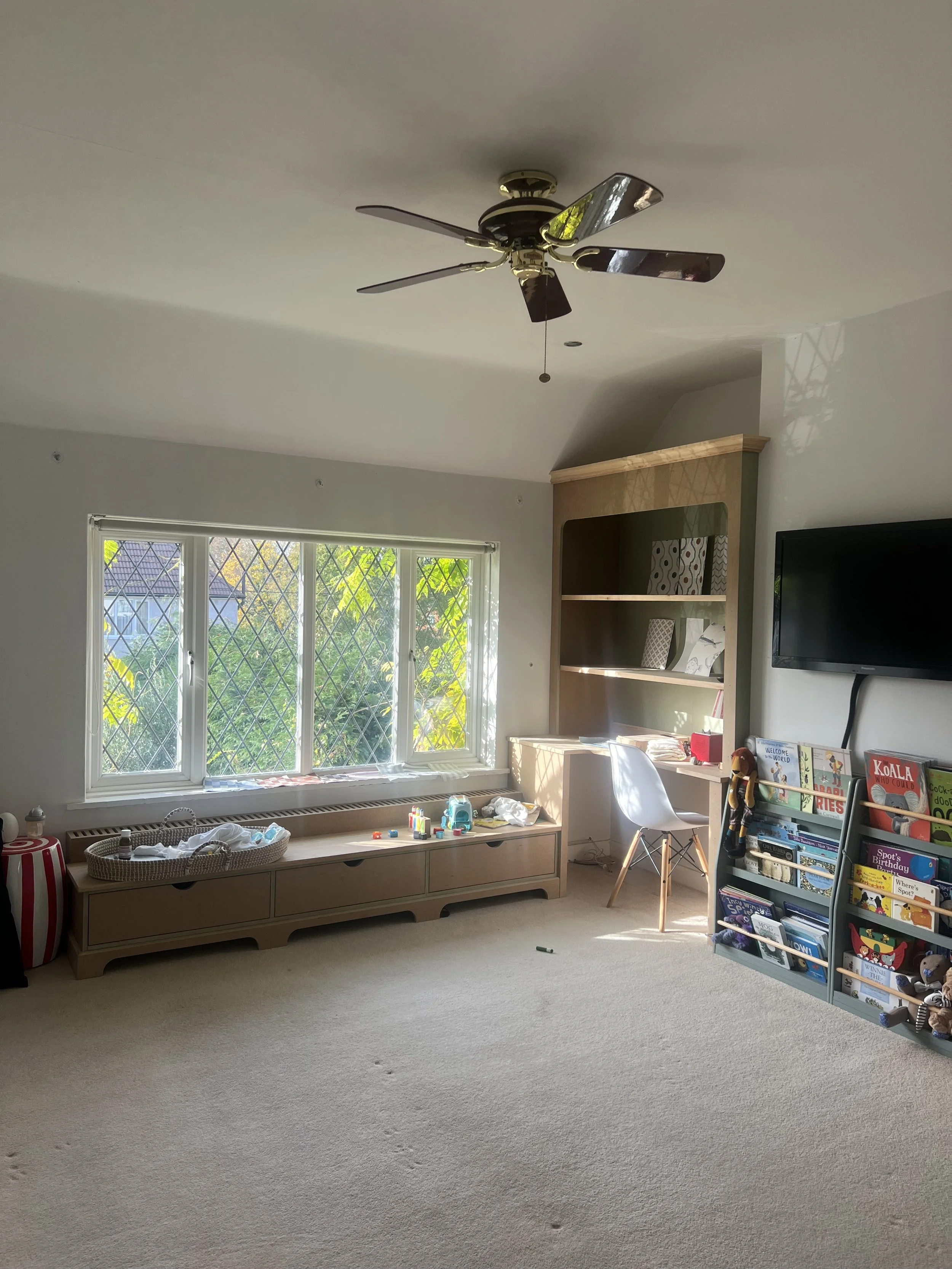
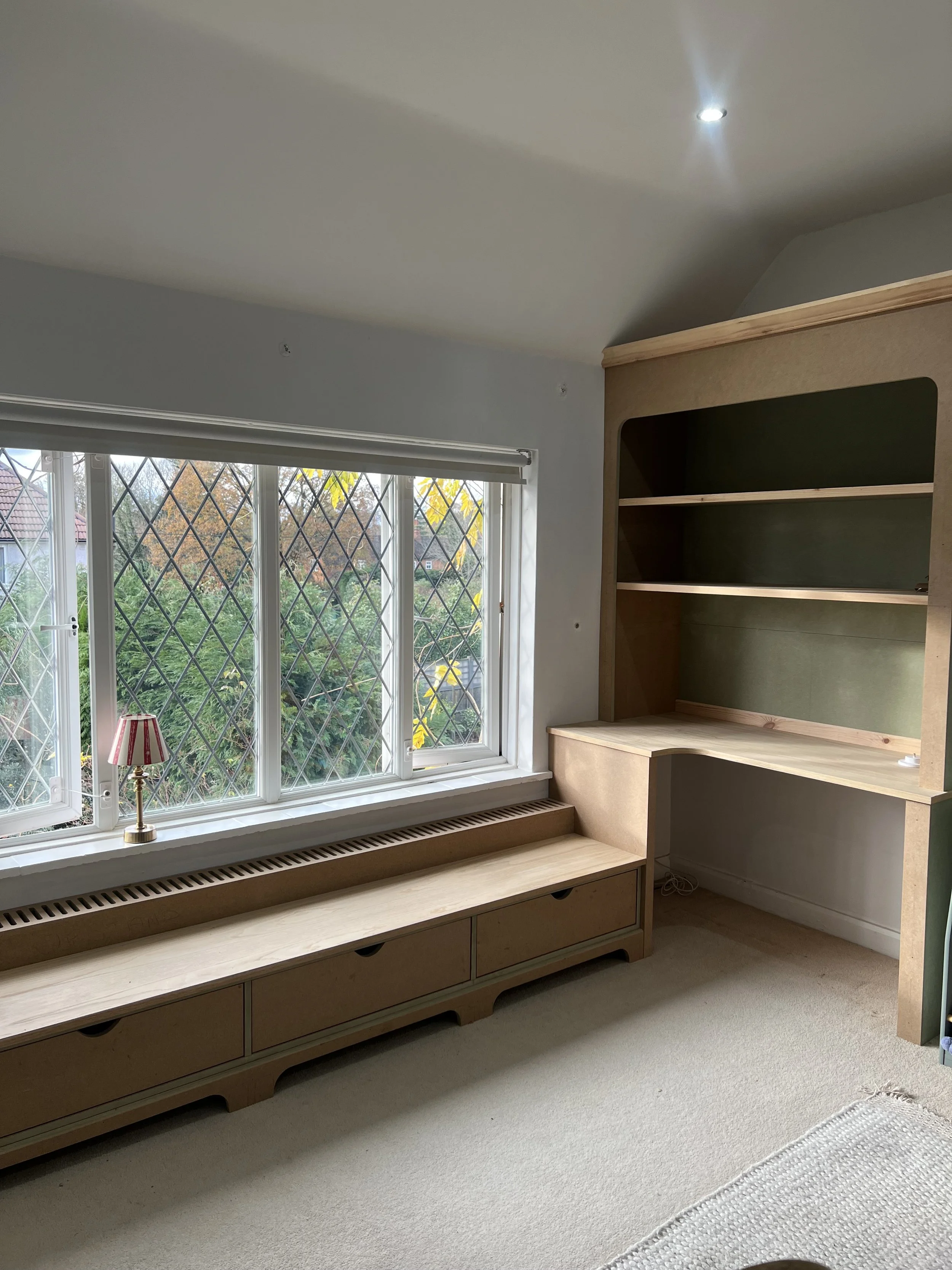
My son's bedroom is our favourite project in the house.
The ‘brief’ was to design a room that would be genuinely beautiful now and grow with him gracefully. Not a baby's room that needed stripping out in three years, but a room with real bones that was timeless.
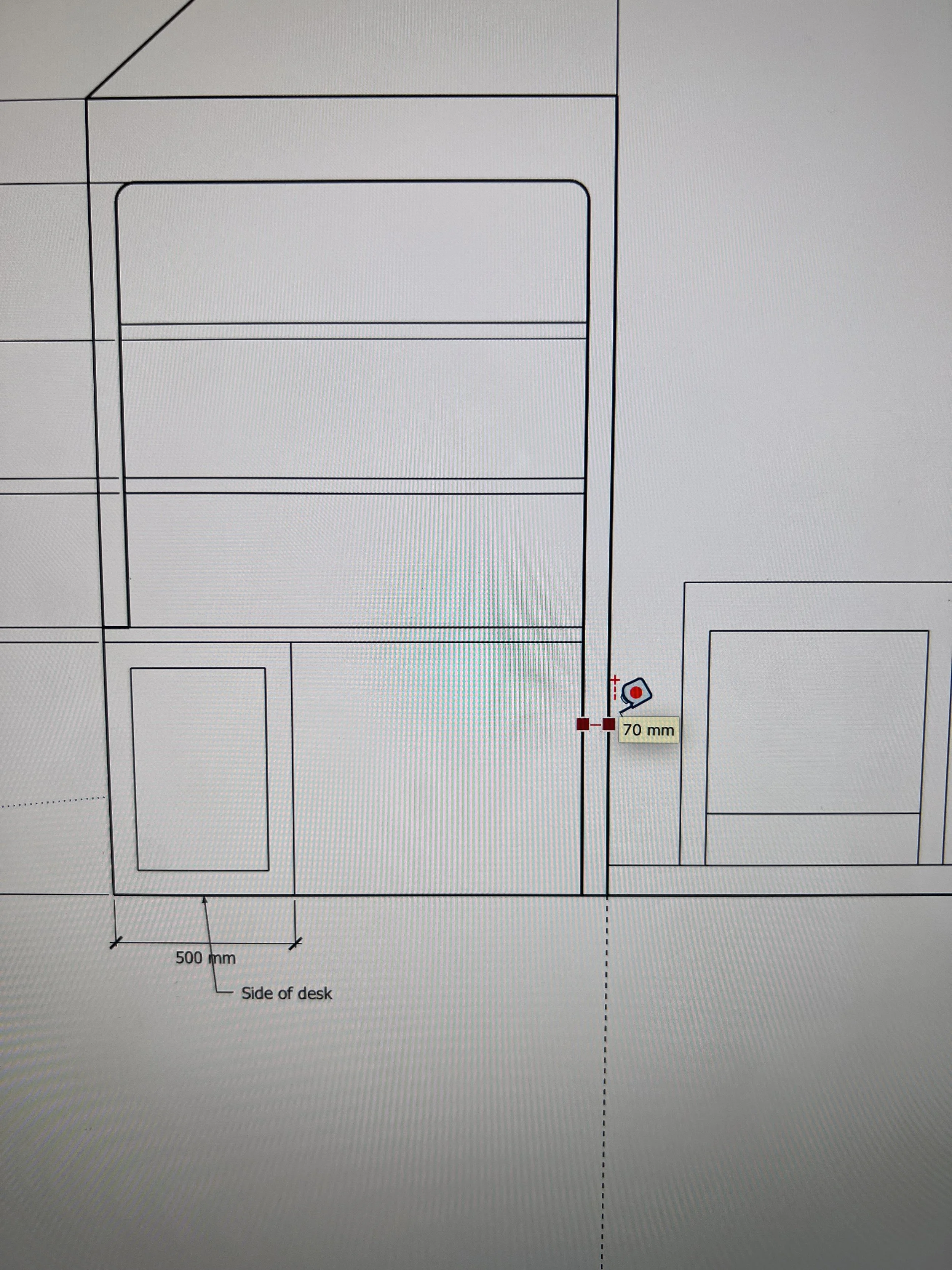
Our extraordinarily talented carpenter built the joinery entirely in oak. A window seat runs the length of a large window and turns the corner into a desk-and-shelving area. The shelves sit in an alcove to the left of the fireplace, and behind them is the Harlequin wiggle wallpaper in blue. The wallpaper is fun and unexpected, the kind of detail that makes a room feel considered rather than safe. The desk will be a study area in time. For now, it holds photo frames and the small, precious things that accumulate in a child's room.
On the wall above the bed is the piece that anchors everything. A large knight on horseback, mixed media, found at an auction house in Sweden. It is bold, a little wild, and completely at home here. The reds in the artwork informed the rest of the room's palette, set against the blue of the wiggle wallpaper behind the shelves.
Next to the wardrobe in the second alcove is a chest of drawers with two paintings above it. The one on the left shows a hot air balloon, painted on silk by my husband's godmother as a gift, and is now 38 years old. The one on the right is a recreation painted by my own mother for our son, with a hot air balloon flying over the Rock of Gibraltar.
BEFORE AND PROCESS
STARTING TO THINK ABOUT YOUR HOME?
20 minutes | No obligation | Always free